I’m just under a week into my challenge now and currently I have written approx 7500 words of the new book. While I am not quite on target at the moment I’m not too worried. I’ve found with writing books that the first 10,000 words or so take by far the longest. They are the words that are hardest to find, the characters are still not quite defined right and require thinking about more . Also I find about 90% of my research is needed in the first 10% of the book.
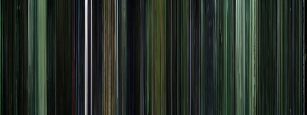
However, I think it’s also fair to say I have been rather distracted and I wish to share a few of my distractions with you. The first was a link on a friends facebook page I found last Thursday. The moviebarcode website, where this one guy has taken every screen from a movie and put them all together in a row, then squished them all up into one image, just over 8 inches long. I was very distracted by these pretty pictures and they led to me thinking about movies and the overall impression a film gives. On page 3 of this guys website there is a beautiful green hued picture. Can you guess what film it is before you see the title?
Well it’s The Matrix (surely all that green gave it away?), I have to admit I couldn’t help wondering at this point if the second and third matrix films would be infinitely improved by being turned into one of these pictures instead.
That wasn’t what got me thinking though. It was the next few pictures I saw. I started to go through and noticed that all the happy animated films like Toy Story and How to train your dragon had lots of lovely bright colours and made really pretty pieces. I began to wonder if the essence of these films was coming out in the 8 inch barcode made from them and it got me thinking. We put art on our walls because of how it makes us feel. Happy pieces often go up in hospitals etc to try and brighten the places up and I’ve heard of people randomly buying up artwork, because it makes them feel better about something, on some deep level they don’t fully understand.
What if it’s like this with the films we watch as well? What if they actually leave an imprint behind on us, depending on the film we watched and the relative artwork within it? Would you start being more careful what films you watched? I think I just might. If I wouldn’t put a picture that made me feel depressed on my walls why would I watch a film that had the same undertones and left the same feeling behind just because it’s mildly entertaining? It doesn’t really make sense to.
Take this next movie barcode for example. Would you hang this on your wall?
I know I wouldn’t. It’s dark, oppresive and would just make me feel sad and overwhelmed everytime I looked at it. So I guess that means I won’t be watching The Dark Knight again. Just too much heavy atmosphere for it to be entertaining. I want to feel better after I’ve taken time out to relax and watch a film.
If that’s all a bit too heavy for you, you can check out my much lighter distraction, that didn’t lead to much other than a debate on whether fuschia pink toilet paper was too much. All courtesy of Fiona Flame’s interior design blog last Friday. It’s available from redcandy.co.uk and they have toilet paper as well as kitchen roll and pocket sized packets of tissues in all sorts of funky colours. I have to admit I was quite tempted by the black toilet paper, even when Ms Flame informed her blog readers Simon Cowell uses it.
You can check out the moviebarcodes here.
Fiona’s interior design blog here.
And the Fuschia toilet paper at the Redcandy store here.


Leave a Reply